Mastering Exploratory Data Analysis with D-Tale Tools
Written on
Introduction to Data Science
As American mathematician John Tukey wisely noted, “The greatest value of a picture is when it forces us to notice what we never expected to see.” In the realm of data science, the objective is to derive insights and meaning from seemingly random datasets.
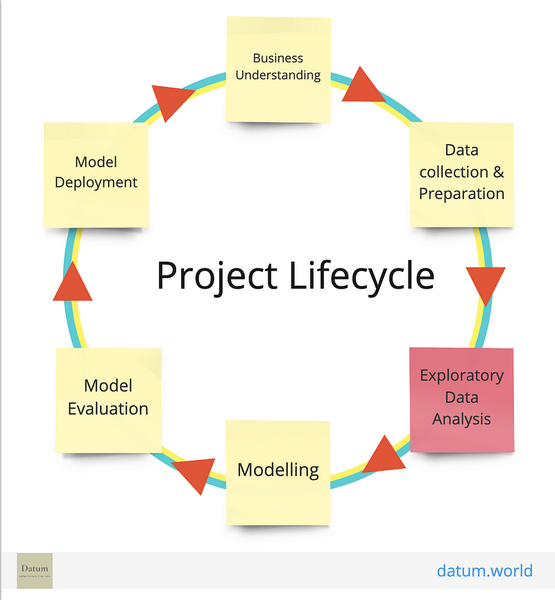
The journey of a data scientist begins by establishing a 'Project Lifecycle', which outlines the essential steps required to achieve the desired outcomes. Below is a visual representation of the Project Lifecycle:
Understanding the Data Lifecycle
The initial phase of the Data Lifecycle focuses on gathering extensive data about the business and its operations. During this stage, business stakeholders provide valuable insights and define their goals for the project. After this phase, the data scientist is left with a variety of unclear figures and information that must be interpreted. Analyzing this diverse data is crucial for revealing facts, relationships, and other significant aspects of the dataset.
What is Exploratory Data Analysis?
The second step in the Data Lifecycle is known as Exploratory Data Analysis (EDA). This phase involves cleaning and preparing the collected data, which can be one of the most challenging parts of the process. Data scientists often find themselves navigating unclear work directions and lacking clear validation methods for their progress.
A vital aspect of predictive modeling is data exploration, which emphasizes understanding the history of the data to make accurate predictions about new information. EDA is essentially the process of familiarizing oneself with the data by examining the relationships among various features and visualizing the dataset to identify outliers and hidden patterns.
While data preparation can be time-consuming, advancements in data exploration have made significant strides. Today, open-source libraries provide an efficient alternative to traditional coding methods. The trend is shifting towards no-code or low-code approaches to explore complex datasets.
Key Libraries for Data Exploration
Several libraries have emerged as frontrunners in the field of data exploration, including:
- D-Tale
- Sweetviz
- Predictive Power Score
- Pandas Profiling
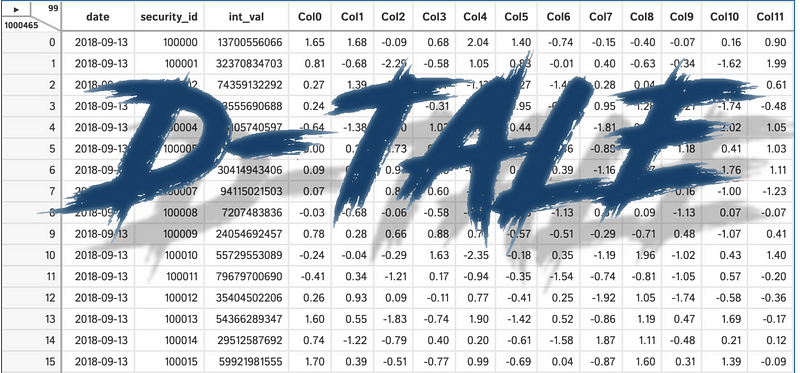
D-Tale is a user-friendly web-based library that utilizes a Flask backend and a React frontend to facilitate the viewing and analysis of Pandas data structures. It integrates effortlessly with Jupyter notebooks and Python terminals, supporting various Pandas objects, including DataFrame, Series, MultiIndex, DatetimeIndex, and RangeIndex.
A Brief History of D-Tale
D-Tale originated from a conversion project from SAS to Python. What began as a Perl script wrapper for SAS’s insight function has evolved into a lightweight web client for Pandas data structures.
Installation of D-Tale
To install D-Tale via PyPI, use the following command:
pip install dtale
For conda users, execute:
conda config --add channels conda-forge
conda install dtale
Once installed, import it into your working environment:
import dtale
import pandas as pd
To launch the D-Tale application on localhost, execute:
df = pd.read_csv('data.csv')
d = dtale.show(df)
d.open_browser()
Here’s an example of a housing dataset:

Exploring the D-Tale Interface
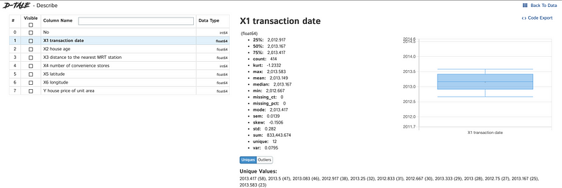
Upon launching the application, users can interact with a table to perform various actions and visualize the dataset.
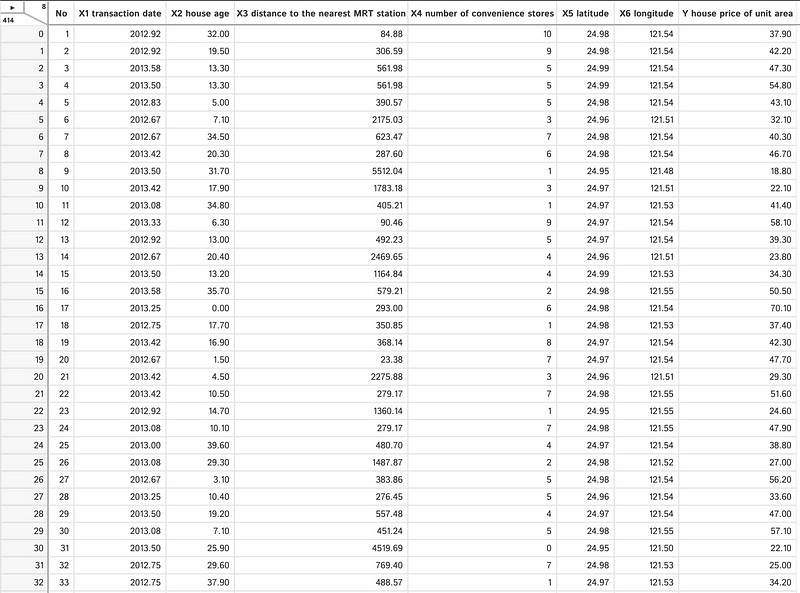
The top left corner of the interface displays the data dimensions, indicating (8x414) in this case.

Utilizing D-Tale's Powerful Features
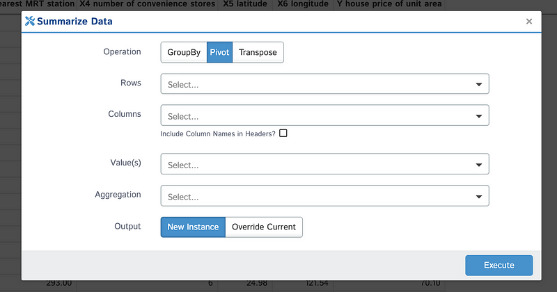
One of the standout functionalities of D-Tale is the ability to summarize data. This allows users to create new DataFrames by grouping, pivoting, or transposing existing data.
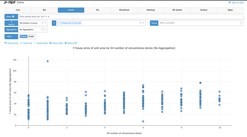
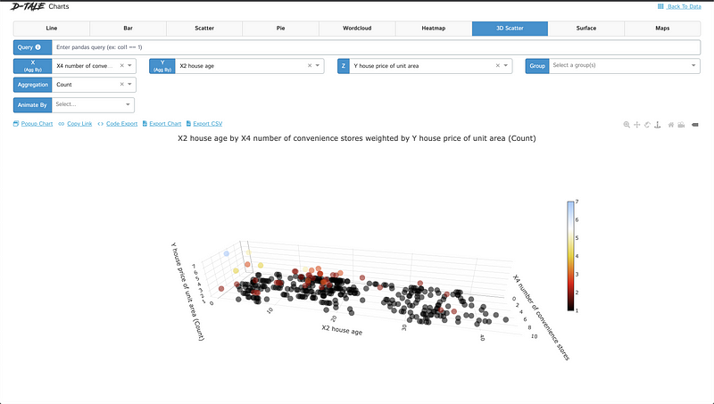
Charts enable users to generate custom visualizations through Plotly DataViz. Users can select values for the X and Y axes, and for 3D charts, an additional Z-axis value can be specified.
Link Sharing and Chart Exporting
The “Copy Link” feature allows users to save a link to a pre-populated chart for easy sharing. Note that the D-Tale process must be active to view the chart via the link.
Charts, except for word clouds, can be exported to HTML files for easier sharing, with embedded JavaScript for enhanced user interaction.
Additionally, users can export chart data to CSV for further analysis in applications like Excel.
Heatmap and Correlation Matrix Features
The heatmap function applies background colors to cells based on data values, normalizing each float to a range of 0 to 1.
Building a correlation matrix is crucial for feature selection in predictive analysis, allowing users to visualize correlations without extensive coding.
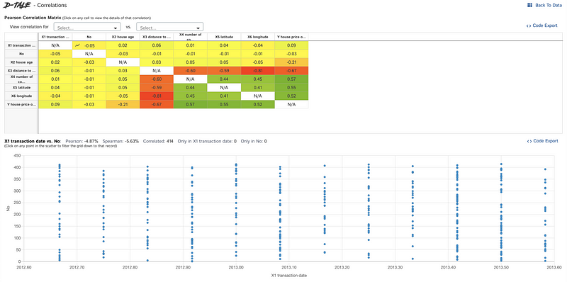
D-Tale also provides outlier detection features for integer and float columns, alongside options to highlight missing data fields.
The code export feature enables users to obtain reusable code snippets for their analyses.
Next in the series: Exploratory Data Analysis [2/4] – Using ‘Sweetviz’

