Harnessing the Power of Learning Curves in Machine Learning
Written on
Understanding Learning Curves
Learning curves are invaluable tools in the arsenal of any data scientist. They provide a visual representation of how much a machine learning model improves as more training data is added. This visualization illustrates the correlation between the training score and the test score as the number of training samples varies. Typically, cross-validation techniques are employed when generating these curves.
A well-designed machine learning model not only fits the training data effectively but also generalizes well to unseen data. Occasionally, a model may require additional training instances to achieve better generalization. While incorporating more data can enhance the model's performance, this is not always guaranteed. By examining the learning curve, one can make informed decisions about whether to supplement the training data for improved generalization.
Traditionally, plotting learning curves demands extensive coding, which can be time-consuming. However, the Yellowbrick library in Python simplifies this task significantly, allowing us to create a learning curve with just a single line of code! This article will guide you through plotting learning curves using Yellowbrick and interpreting their results.
Prerequisites for Success
To fully benefit from this tutorial, it is advisable to first read the section on “Using k-fold cross-validation for evaluating a model’s performance” in my article about k-fold cross-validation explained in straightforward terms. Additionally, familiarity with Support Vector Machines (SVM) and Random Forest algorithms is beneficial, as we will be plotting learning curves based on these models. If you need a refresher, consider reviewing the following resources:
- Support Vector Machines with Scikit-learn
- Random Forests: An Ensemble of Decision Trees
Installing Yellowbrick
Yellowbrick is not included in the default Anaconda installation, so you will need to install it manually. Open your Anaconda prompt and execute the following command:
pip install yellowbrick
If that fails, try using the following command with the user tag:
pip install yellowbrick --user
Alternatively, you can use the conda-forge or DistrictDataLabs channels:
conda install -c conda-forge yellowbrick
conda install -c districtdatalabs yellowbrick
Any of these methods will successfully install the latest version of Yellowbrick.
Plotting the Learning Curve
Let’s examine example code that demonstrates how to plot the learning curves for an SVM and a Random Forest Classifier using the built-in breast cancer dataset from Scikit-learn, which contains 30 features and 569 training samples. We will explore whether increasing the dataset size aids in the generalization of the SVM and Random Forest models.
Learning Curve — SVM

Learning Curve — Random Forest Classifier

Interpreting the Results
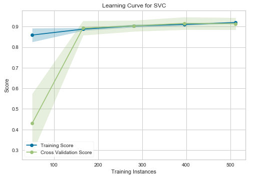
In the graphs above, the “Training Score” denotes the accuracy of the training set, while the “Cross-Validation Score” reflects the accuracy of the test set. For the SVM model (left graph), until approximately 175 training instances, the training score is significantly higher than the test score. Thus, if your dataset has fewer than 175 training instances (for instance, around 100), adding more training data could enhance generalization. However, beyond the 175 instance mark, further data additions may yield diminishing returns.
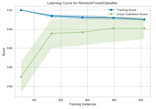
On the right, for the Random Forest Classifier, the training and test scores have yet to converge, suggesting that this model could benefit from additional training data (e.g., between 700 and 1000 training instances).
How It Works
When you invoke the learning_curve() function, a significant amount of processing occurs behind the scenes. With Yellowbrick, you can plot the learning curve with a single line of code. The first argument in the learning_curve() function is the Scikit-learn estimator (in this case, an SVM or Random Forest Classifier). The second and third arguments correspond to the feature matrix (X) and the target vector (y). The “cv” parameter specifies the number of folds for cross-validation, with common values being 3, 5, or 10 (here, we use 10). The scoring argument determines the evaluation method for the model, with “accuracy” and “roc_auc” being common choices for classification tasks.
When running the learning_curve() function, the cross-validation process is handled internally, so you do not need to manually split the dataset into training and test sets. This method ensures that the accuracy score is not unduly affected by random data partitioning. Using cross-validation, the accuracy is averaged over 10 iterations (with cv=10).
Key Takeaways
Learning curves are essential tools for assessing how effectively a model can benefit from additional training data. They help determine if more data will enhance generalization to new inputs. It is important to distinguish between learning curves and validation curves, as the latter focuses on the impact of a single hyperparameter. If you wish to delve deeper into validation curves, refer to my article, “Validation Curve Explained — Plot the Influence of a Single Hyperparameter.”
Thank you for reading!
This tutorial was developed by Rukshan Pramoditha, the creator of the Data Science 365 Blog.
In this video, you will learn about the learning curve in machine learning, including how to plot it and interpret its significance.
This tutorial focuses on plotting the learning curve and confusion matrix in TensorFlow, providing insights into model performance.